gui-widget-mixins
| (require gui-widget-mixins) | package: gui-widget-mixins |
A small collection of mixin classes to improve the GUI widgets provided by Racket. These mixins be used individually or combined together. This blog post describes how these mixins work and this library is an improved version of what is presented there. The following mixins are defined:
cue-mixin – a mixin which will add a cue text to a text-field%, whenever the field is empty, this can be used to provide a hint for what the contents of the field are expected to be
decorate-mixin – a mixin to decorate the contents of text-field% widgets
tooltip-mixin – a mixin which adds a tooltip to any GUI control, when the user hovers the mouse over the control
validate-mixin – a mixin to provide data validation for text-field% widgets, for example to allow the user to only enter numbers, or valid dates
1 Examples
To run the examples shown in this section, you will need a simple GUI application with a frame% instance, so the the following "prelude" code is used in all examples, this should be added before the examples shown below, in order to obtain runnable programs.
#lang racket/gui (require gui-widget-mixins) (define toplevel (new frame% [label "Example"] [border 15])) (send toplevel show #t)
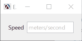
The cue-mixin will add a cue text to a text-field, whenever the field is empty, this can be used to provide a hint for what the contents of the field are expected to be. In the example below, the input text-field% will display the cue "meters/second" when it is empty. This will show up in gray color, to make it distinct from normal input and the client code will get an empty string back when it retrieves the value of the field.
(define speed-input (new (cue-mixin "meters/second" text-field%) [parent toplevel] [label "Speed "]))
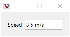
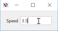
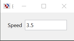
The decorate-mixin can be used to decorate a value when the text input does not have focus, and remove the decoration when the user edits the value. To continue our previous example, the decorate mixin which adds "m/s" to the value entered in the field can be defined like this:
(define speed-input (new (decorate-mixin (decorate-with "m/s") text-field%) [parent toplevel] [label "Speed "] [init-value "3.5"]))
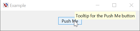
Unlike the other mixins in this package, the tooltip-mixin can be used to add tooltips to any gui control, in the example below, it is added to the button% class. The class returned by tooltip-mixin will accept an extra init parameter to specify the string to use:
(define button (new (tooltip-mixin button%) [parent toplevel] [label "Push Me"] [tooltip "Tooltip for the Push Me button"]))
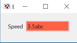
The validate-mixin can be used to restrict the contents of a text-field% to specific values. It will not actually prevent the user from typing invalid values in the field, but it will highlight the field in red if the value is invalid and the text-field% callback will only be invoked for valid values. There are additional methods and functionality available, see the reference for validate-mixin. As a simple example, the code below creates a text field which only accepts numeric values:
(define speed-input (new (validate-mixin string->number number->string text-field%) [parent toplevel] [label "Speed "] [init-value "3.5"]))
These mixins can be combined together, for example the code below will create a class which will have tooltip support, a cue text, and the contents will be decorated and validated. Since most of this functionality is visible when the user interacts with the field, there is no screen-shot provided.
(define speed-input% (tooltip-mixin (cue-mixin "meters/second" (decorate-mixin (decorate-with "m/s" #:validate string->number) (validate-mixin string->number number->string text-field%))))) (define speed-input (new speed-input% [parent toplevel] [label "Speed "] [tooltip "Speed in meters/second"]))
2 Reference
procedure
(cue-mixin default-cue base-class) → (subclass?/c text-field%)
default-cue : string? base-class : (subclass?/c text-field%)
default-cue is default cue string to be displayed in all instances of this class. This can also be specified for each instance of the resulting class via the CUE init field.
base-class is the class to extend with the cue functionality. It must be a text-field%, or an class derived from text-field%
procedure
(decorate-mixin decorate base-class) → (subclass?/c text-field%)
decorate : (-> string? string?) base-class : (subclass?/c text-field%)
decorate is a function which adds a decoration to its value. It receives a string representing the original contents of the text-field% must return a string representing the decorated value.
base-class is the class to extend with the decorate functionality. It must be a text-field%, or an class derived from text-field%
procedure
(decorate-with label [ #:validate validate-fn]) → (-> string? string?) label : string? validate-fn : (or/c #f (-> string? any/c)) = #f
| ||
| ||
|
constructor
(new tooltip-mixin [tooltip tooltip] [tooltip-delay tooltip-delay] ...superclass-args...) → (is-a?/c tooltip-mixin) tooltip : string? tooltip-delay : (and/c integer? positive?) tooltip is a string representing the tooltip to display when the mouse is on the widget.tooltip-delay is the amount of time, in milliseconds, that the mouse needs to hover over the control before the tooltip is shown
procedure
(validate-mixin string->data data->string base-class #:allow-empty? allow-empty?) → (subclass?/c text-field%) string->data : (-> string? any/c) data->string : (-> any/c string>) base-class : (subclass?/c text-field%) allow-empty? : boolean?
string->data is a function converting a string to the data type that holds it. It must return #f if the string is not a valid representation for the input data.
data->string is a function which converts a data type into a string to be displayed in the control.
base-class is the class to extend with the validation functionality. It must be a text-field%, or an class derived from text-field%
allow-empty? indicates whether empty fields are considered valid or not. If empty fields are valid, the GET-VALUE/VALIDATED method will return 'empty for those, so string->data can still return #f for empty strings, and they could still be considered valid by the control.
The resulting mixin class has the following updated behavior, in addition to the text-field% class:
The control will have a red background when the value is invalid and a normal background if it is valid.
The callback of the text-field% only invoked for valid values, not every time the control changes. Also, the callback is only invoked once per value.
callback-delay is a new init field representing a delay in milliseconds for invoking the callback, this prevents invoking the callback with lots of intermediate values (e.g. if the user types in 1234 it avoids invoking the callback for "1", "12", "123" and "1234"). If this field is #f, there is no delay and the callback is invoked immediately.
allow-empty? is a new init field which determines if a text-field% with empty contents is valid or not. Its default value is taken from the ALLOW-EMPTY? parameter to the mixin function, but can be changed for each individual instance of the class.
valid-callback is a new init field representing a callback which is called when the value in the control becomes valid or invalid. It is called with the control as the first argument and a flag indicating if the value is valid or not. (-> control flag any)
validate is a new method which will trigger field validation immediately
The set-value method is updated to allow setting either string value or values that are converted via DATA->STRING.
get-value/validated is a new method to retrieve a value as converted by string->data. It returns #f if the value is invalid and 'empty if the string is empty.